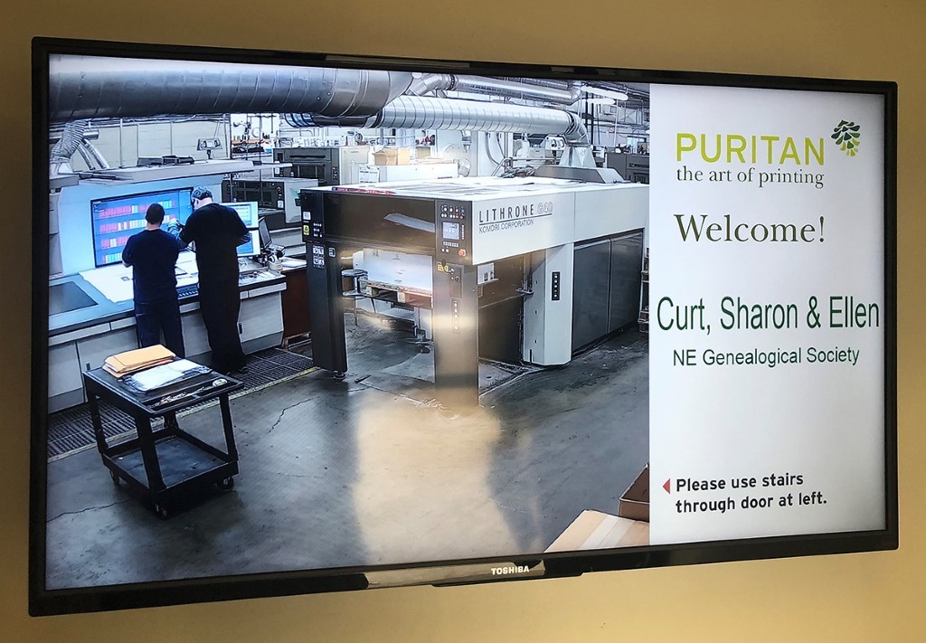
 When Curt and I arrived at Puritan Capital printers for the press check, there was a sign greeting us and showing a live shot of our press and pressmen. (Ellen was unfortunately not able to join us.)
As I said in Family Treasures: View from the index, Curator of Special Collections Curt DiCamillo, Publications Design Manager Ellen Maxwell, and I recently finished work on a beautifully illustrated book called Family Treasures: 175 Years of Collecting Art and Furniture at the New England Historic Genealogical Society. For me and Ellen, the experience was a nice change from the 60+ text-heavy genealogical resources and compiled family histories we have produced in our four years at NEHGS. We enjoyed learning from our author Gerry Ward and our colleague Curt, who brought their combined experience in producing fine art books and museum catalogs to the project.
In the early years of my prior life in educational publishing, I had gone on press checks for books that had print runs of up to 10,000 (Spanish and French textbooks for the high school and college markets, mostly). A press check involved a multi-day trip to a printing plant in some small Southern town to approve the book as it came off the press. I was usually treated to one or two nice meals at the local fancy restaurant. The printer worked three shifts, so I was there all day and all night, going to my hotel only to shower and change clothes. Between approvals, I stayed in a windowless room with a couch, chair, table, phone, and (if I was lucky) a coffee maker with an ample supply of sugar and powdered creamer. There I lived a glamorous editor’s life, waiting while the pressmen were doing their “makeready” (cleaning the press, hanging and aligning the next plates, and doing short test runs to get the color to where they thought it should be).
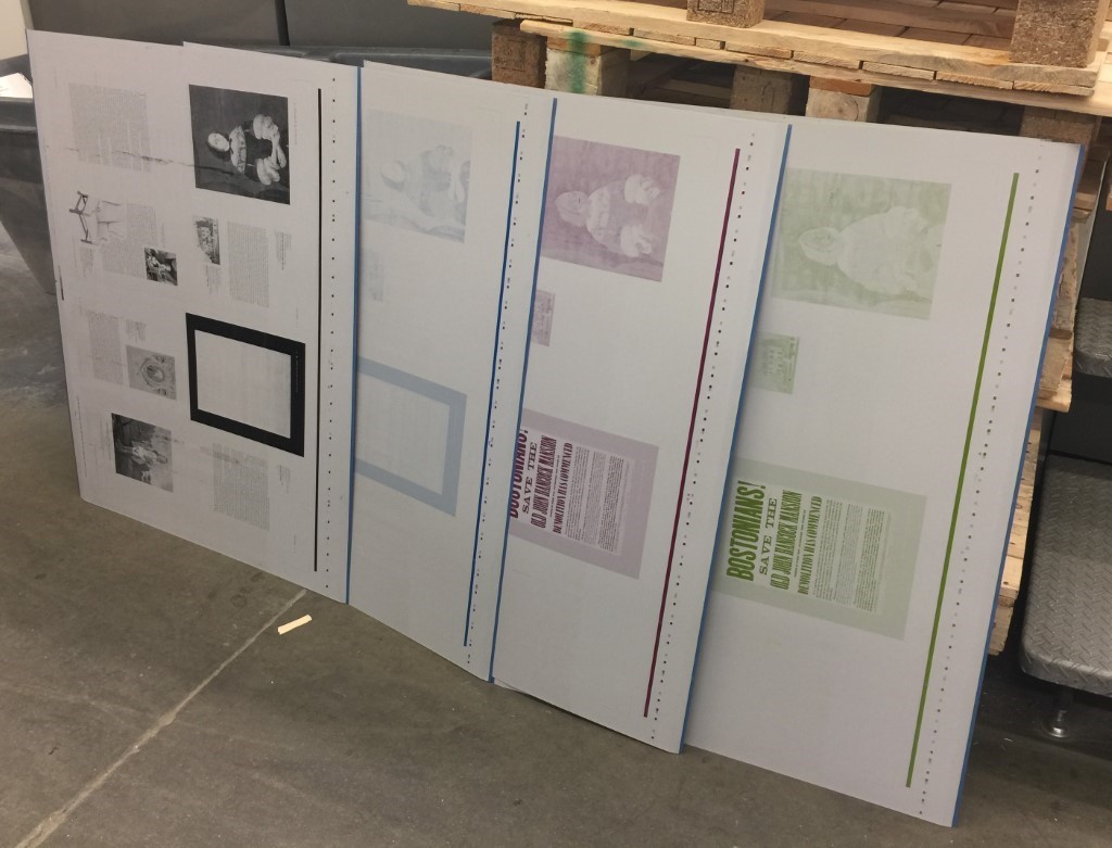 The black, cyan, magenta, and yellow aluminum plates that create one side of a press sheet (a form); our 176-page Family Treasures book was created from 22 such plates.
My job was to approve mostly for color (healthy flesh tones, green grass, blue skies), but sometimes for content, if revised files had been supplied to the printer to make last-minute changes to text or photos. I carried copies of the final round of pages with me to confirm that the correct files had been used to make the plates. If they weren’t, that was a big, expensive problem (and usually the printer’s fault, thankfully).
As you can see in the photo, each set of four plates produces a “form” of eight book pages. Two forms print on opposite sides of a piece of stock (paper) to make a “press sheet.” A double-sided press sheet of 16 book pages, folded and ready for binding, is called a “signature.” (If you look at a hardcover book from the top, you can see the signatures as individual "booklets” of pages.) The printer creates an “imposition,” a kind of roadmap that arranges the signatures so when the press sheets are folded, the pages will be in the right order. All of the printed signatures of a book gathered together are called “F&Gs” (folded and gathered sheets).
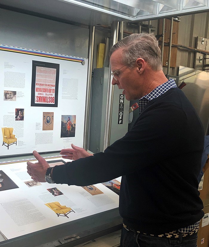 Puritan VP Jay Stewart explains the technical aspects as we work to approve the form created by the plates seen in the above photo.
In late February, Curt and I had the pleasure of going to Puritan Capital printers in Hollis, New Hampshire, to see the printing of Family Treasures, my first press check in many years. Technology has made it a much-improved experience! For an art book such as this, making sure the color is true to the original, while balancing the effects of where the image falls in the form, can be tricky. The team at Puritan did such a marvelous job that Curt and I were able to approve three of the 22 press sheets in just a few hours.[1]
Technology has made printing much more efficient. The Japanese-made Komori Lithrone G40 offset press that Puritan used to print Family Treasures is energy efficient and environmentally responsible. It can print as many as 16,500 sheets an hour, change its own plates, and clean itself! It was also much smaller, quieter, and cleaner than what I saw back in the ‘80s in Kingsport, Tennessee (although I do remember that fancy restaurant had a delicious crème brulée)![2]
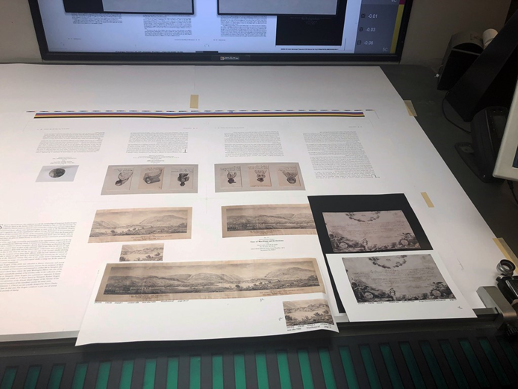 A lot of one color (here, black) in one image will affect the others on the same form, requiring skilled press operators to strike a delicate balance. Previously approved proofs of each image serve as a guide.
Notes
[1] Puritan Press Inc. website
[2] Komori Corp. website